|
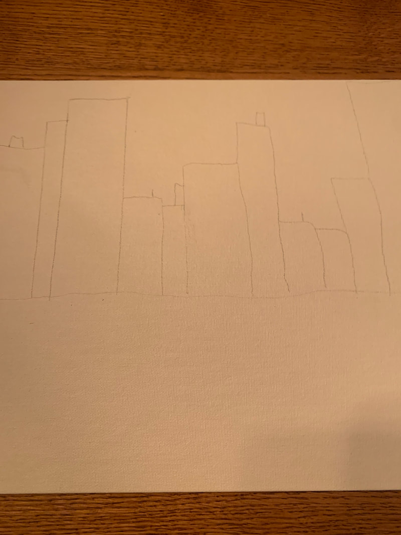
My best artwork this semester was probably the self portrait. I like that one the most because I think that I tried the hardest and spent the most time on it. 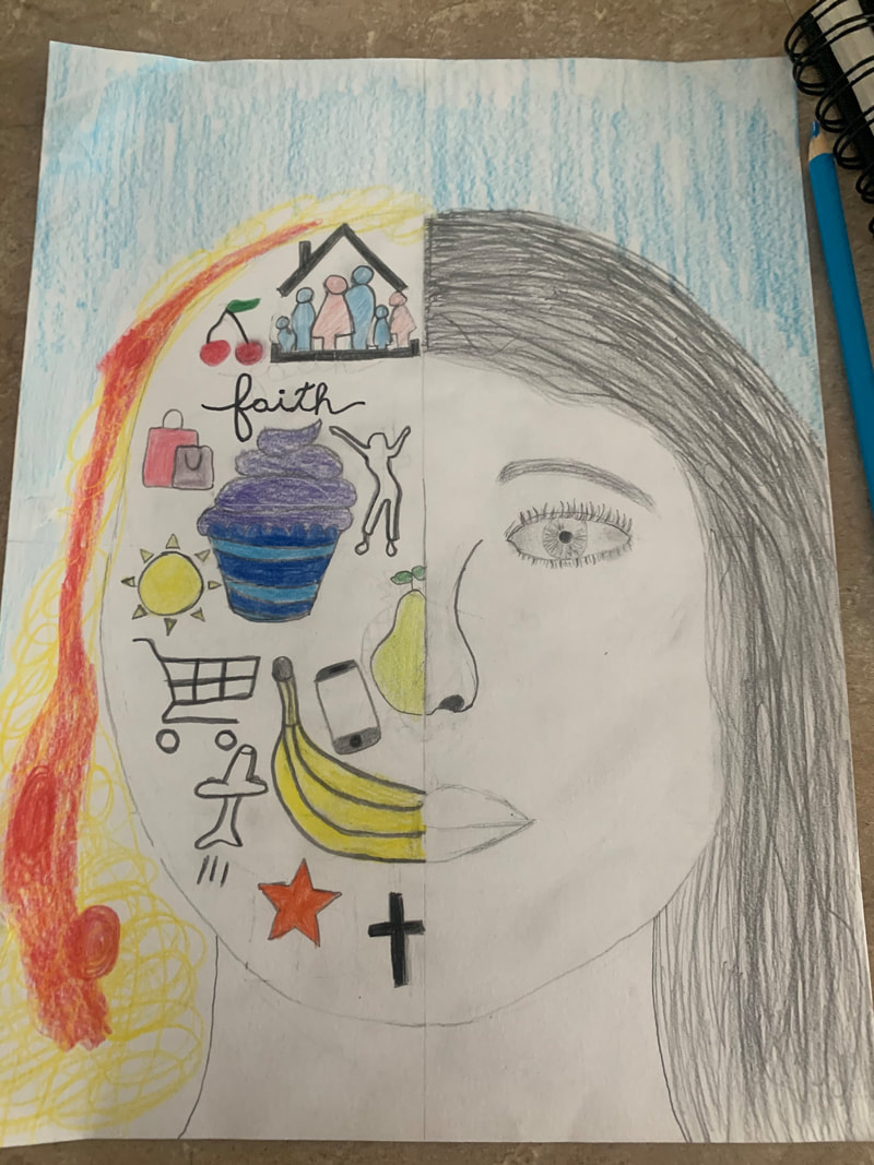 An artwork that I'd like to redo is the citiscape one. I just don't like the way it turned out and I think I should've tried something different. 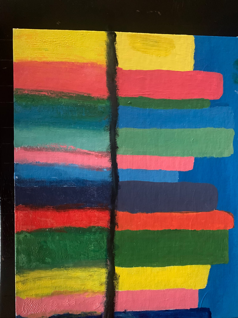 I learned that it's okay to try something new and there's always someone that can help you do better and learn more about it. one thing that I wish we could've done is more college. 
0 Comments
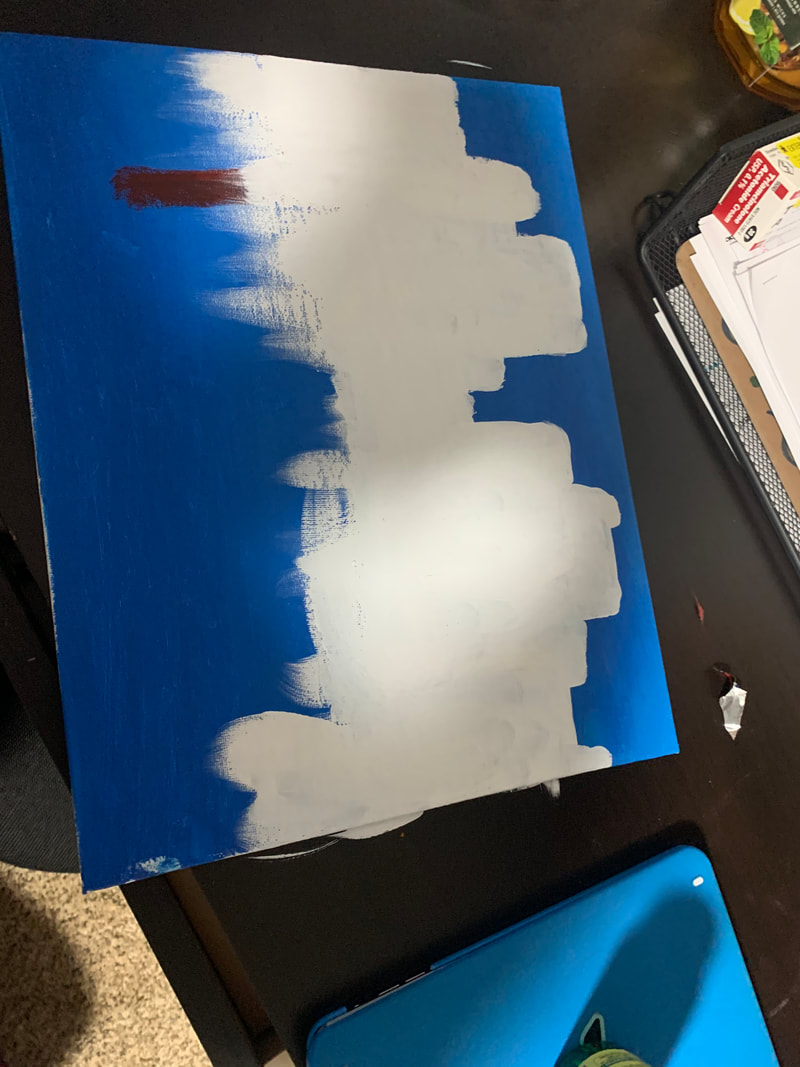
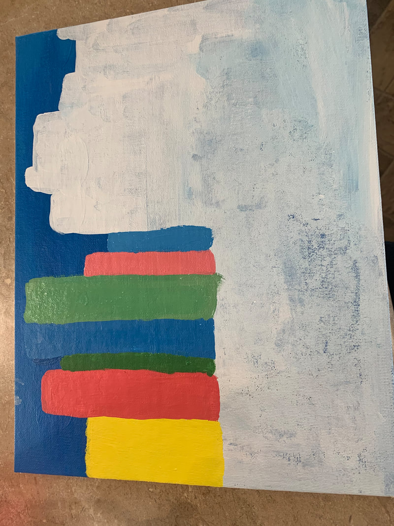
this artwork is half of things i like and half a self portrait. on the right side you see the self portrait. on the left side you see some things i like. some of those things are my family , fruits, dancing, traveling, baking, shopping, summer, and my faith. i created my artwork with pencil and colored pencil. the big idea behind my artwork is to show more about me. my goals were to get it done and improve from my last years self portrait. i think that i did make my goal and that it's not the worst artwork i made this year. 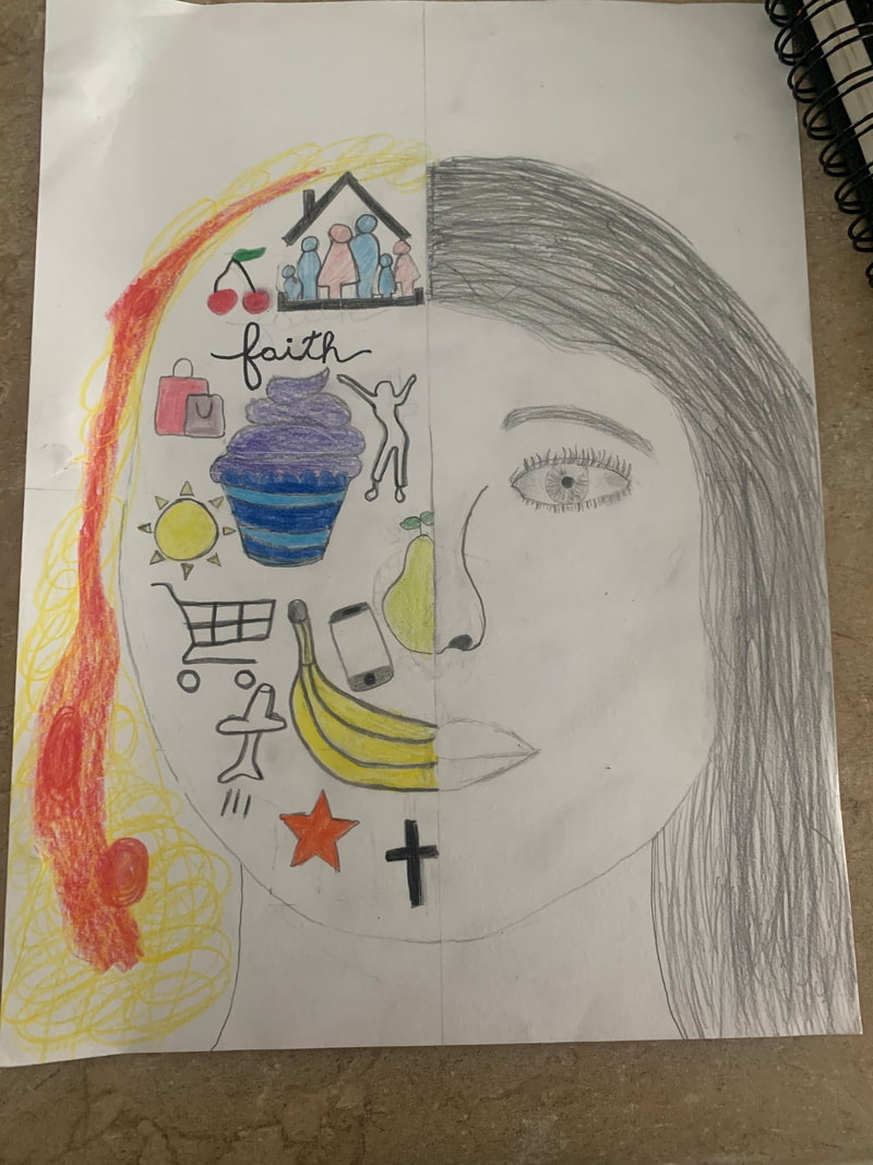 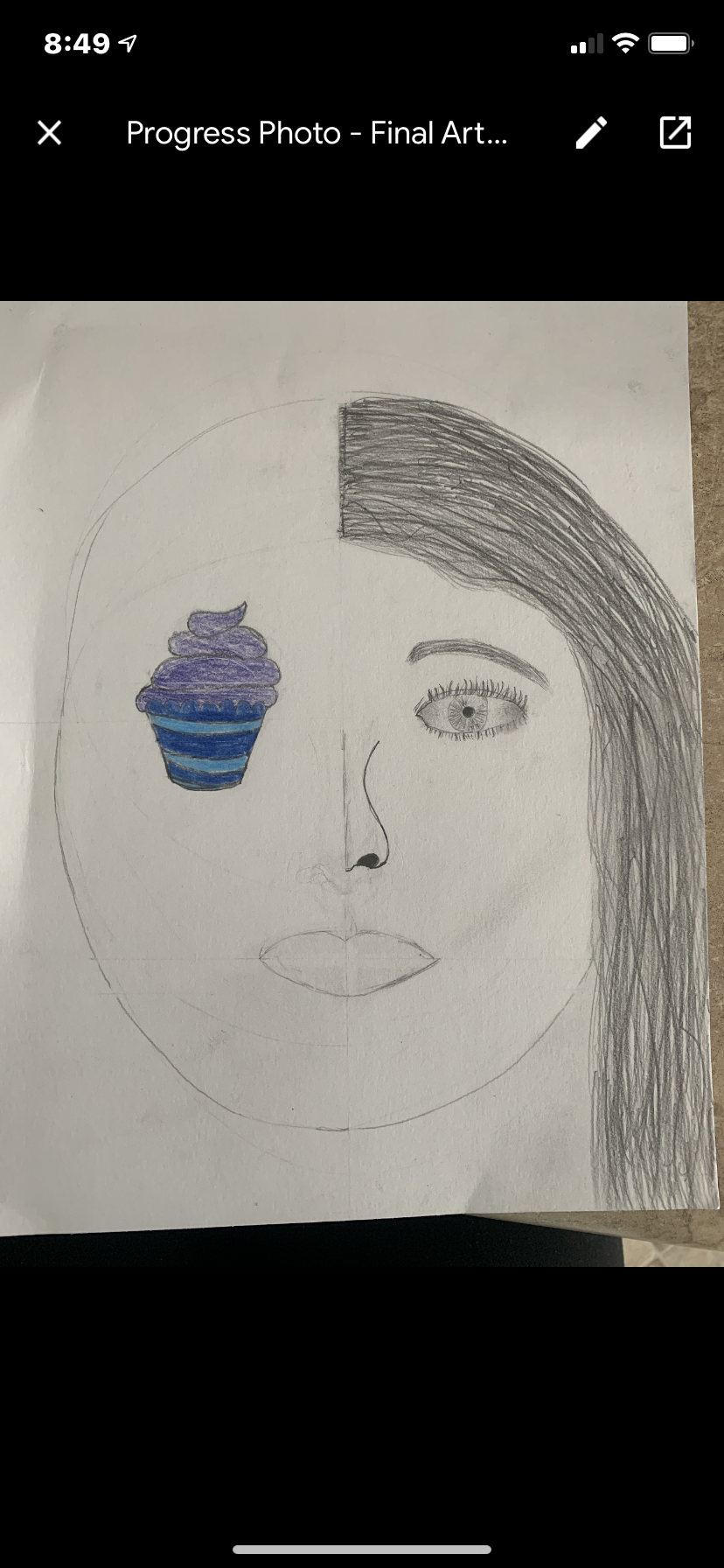 my plan is to do a half and half drawing. i want to use envision and observe.  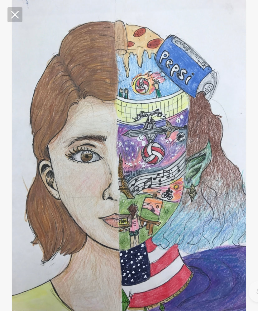 I used two studio habits of mind. One of them was develop craft because I used different pieces and made it into an artwork. I also used observe by looking closely at how to use it.  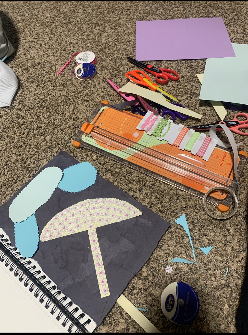 M artwork is a cityscape and it has colorful buildings right above the water. The buildings are reflecting onto the blue water and the sky is blue. I used paint to create my artwork. The big idea for my artwork was to have it show something I love and want to see. My goal was it have it look realistic and fun. My overall thoughts is that I think I should've done something different to make it look better, but it is still okay. Two studio habits of mind that i'm using on this artwork are engage and persist and reflect. I am using engage and persist because I had some troubles but I just covered it up and tried again. I am also using reflect by using my workspace and time wisely.
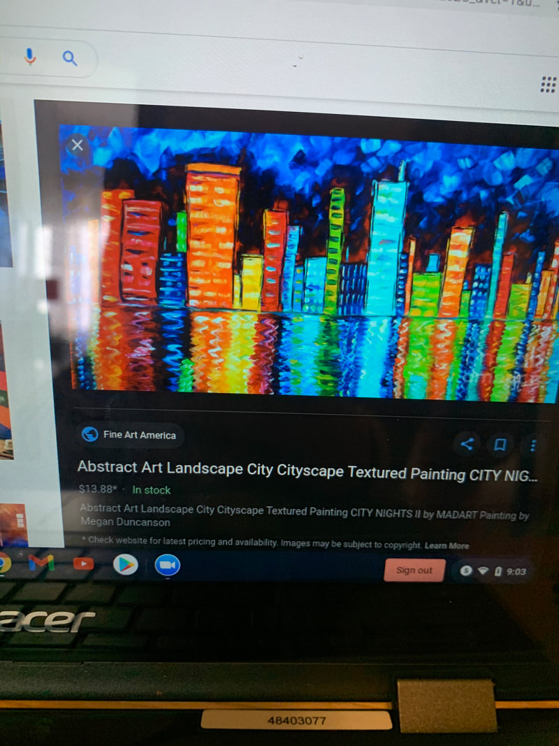
two studio habits of mind that i used in painting boot came areenvision and express. i used envision by considering how my pattern would look before i painted. i used express by expressing how i felt and how i wanted it to look. at first i was going to do a river with trees and do a landscape. then i started to think that i wanted to do a cityscape. the picture on the left is my inspiration.
Dan Bruggemans art was very detailed. You can tell he really takes his time on his artworks. I think that Dan loves what he does and he likes when it turns out the way he wanted it to. I think my drawing showed nature and man-made colliding by the bridge going into the cliff and how they have to sometimes move nature to fit in what we need as people. I also think that it didn't ruin nature but I also think it would be a very pretty spot without the bridge but I also feel like it looks just fine with the bridge.
My artwork looks like a circle with the State Minnesota drawn in it. On the outside of the circle there is mountains and pine trees and grass. The title of my artwork is traveling. The most obvious thing in my artwork that stands out I would say is Minnesota because it's painted gold and the rest is like just regular colors. I created my artwork with the media oil pastels and black Sharpie and gold paint. The big idea of my artwork is to express how much I love traveling. I tried this show the emotions of passion and adventure. Some of my goals for this artwork was to express how I felt and to show how much I like traveling. I feel like I did reach my goals because I showed Minnesota and different places I want to go like mountains. I would say my artwork turned out different than I thought but I don't mind it. This artwork will influence my other artworks by seeing what materials are used and how I can change and how I can improve.
|
AuthorMy name is Lily and i like going to the lake. Archives
January 2021
Categories |
 RSS Feed
